Porcelain Sky
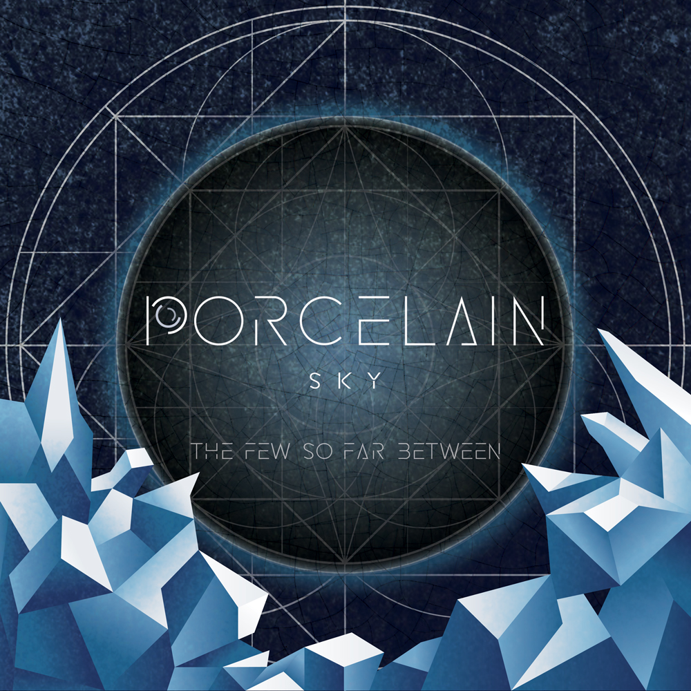
An alternative metal band formed in 2015 and active in the Vancouver music scene. The band wanted a new logo and album art for their first EP “The Few So Far Between”.
- Projects
- Logo & Album Booklet
- Role
- Designer
- Year
- 2016 to 2019
Getting to know the band
The band wanted to avoid representing their genre as “all about metal”. They wanted to present a unique image to represent them as individuals and their music as original. Sample images provided were geometrical shapes as well as landscape in a digital/abstract style. After listening to their album, “Porcelain Sky” felt like a “light and minimal” style of music.


Logo design
The first idea that came to mind was a mouse holding a cashew, instead of the typical piece of cheese. Another idea was to include a kitchen object to represent the client, who makes all of the cheese from scratch; as such, the final design includes a chef hat.
The custom font was requested while the artwork and CD album was created. The remaining letters and numbers were designed around the “Porcelain Sky” logo.
Artwork & CD Album Booklet
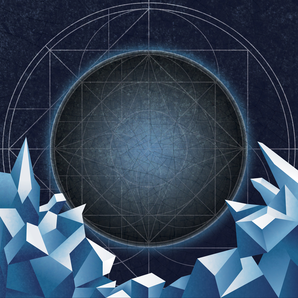
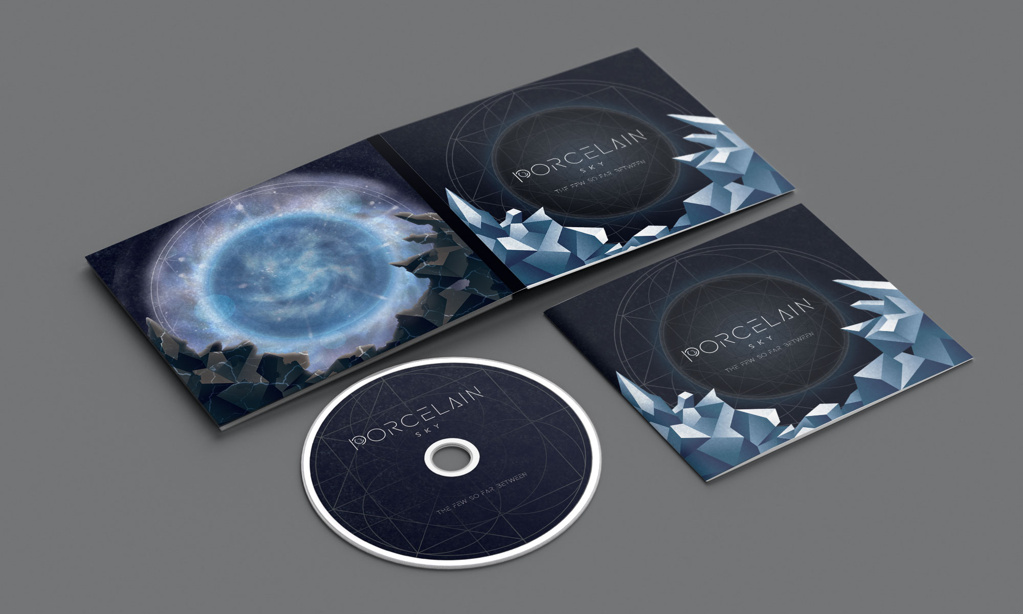
While maintaining the focus of a unique image to represent both the band as individuals and their special style of music, the band wanted to include geometrical shapes and landscapes drawn in a digital/abstract style.
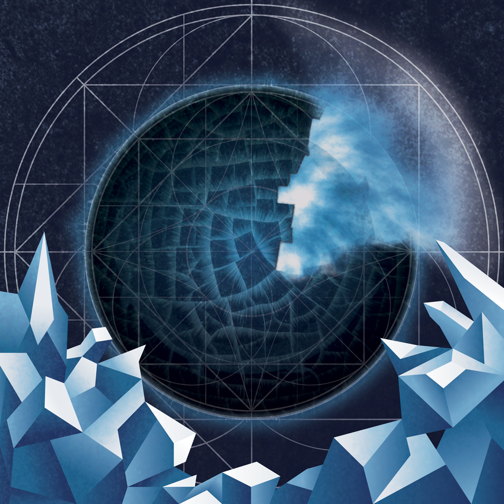
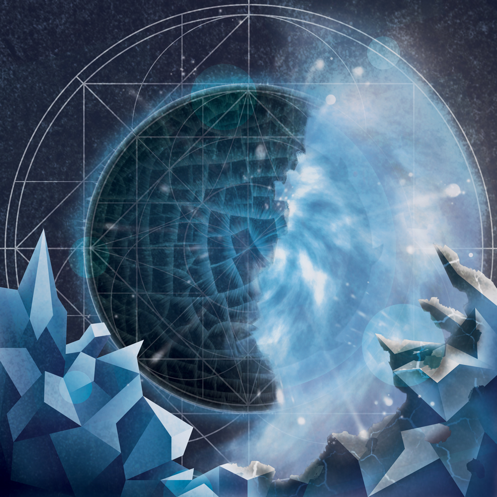
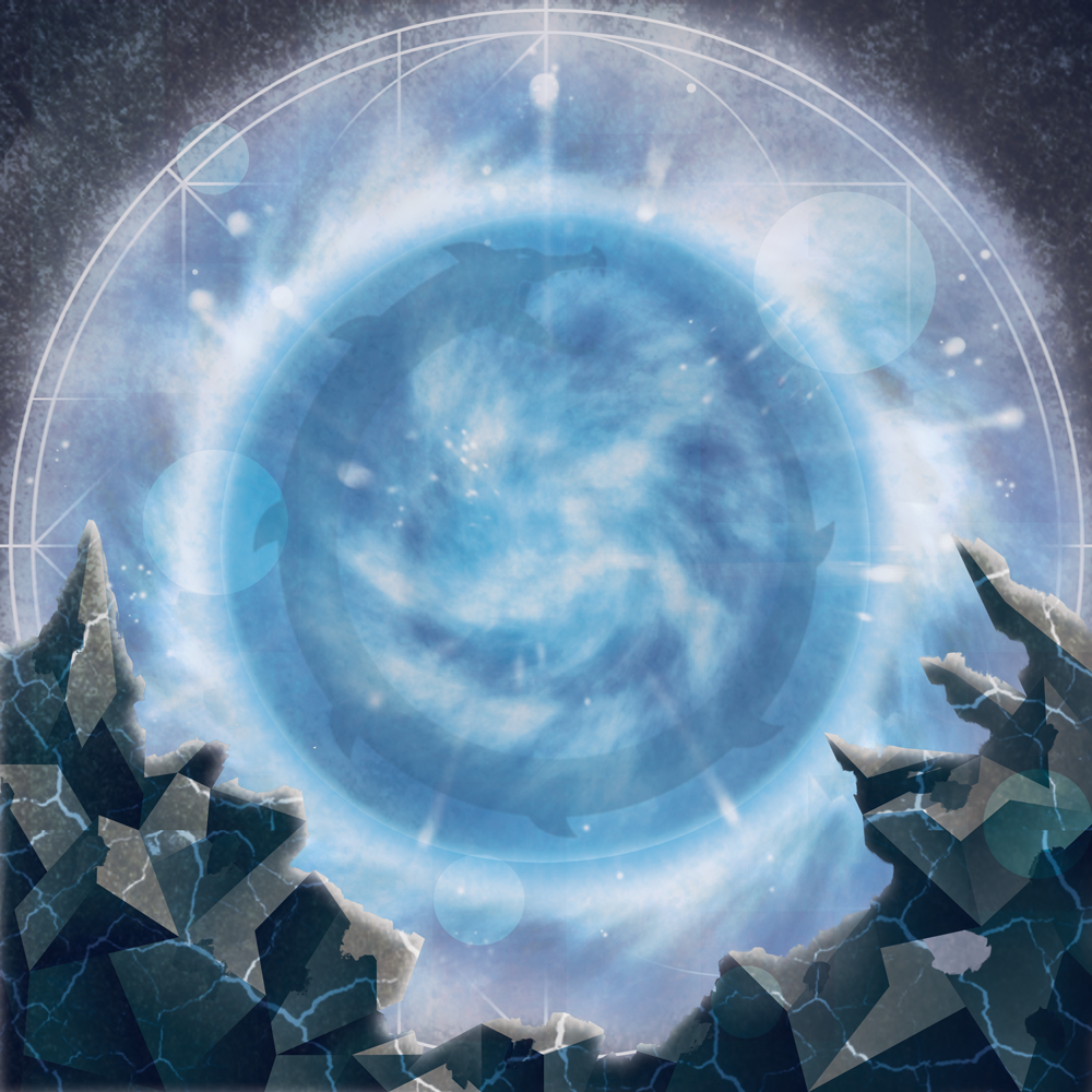
After the album artwork was completed, the band wanted to continue the artwork and create a 4 to 8-page booklet. This booklet reflected the story of evolution, with the planet cracking open and building up to an implosion, which brought enlightenment with a beautiful range of blue colours and light, instead of destruction. Inside the planet was revealed a faint dragon. At each stage, the planet imploded in a clockwise motion, representing “time”. The final image represented “Life” within, while only the surrounding mountains were destroyed.
The album and booklet project was created in Photoshop.
Final result
The band continues to grow and develop a name for themselves in Vancouver, B.C. This was my first attempt to work in a new graphic style, as most of my previous designs were simple 2D illustrations. This was an enjoyable experience and project to work on.
Both projects were completed in Adobe Illustrator and Photoshop.
